 Nederlands
- background is transparent
- mark is white
- PNG files are borderless
- background is transparent
- logo is white
- PNG files are borderless
- Use PMS or CMYK for printed media.
- Use RGB or HEX for digital media.
- The middle column shows the base color.
- The left column shows a lighter variant
- The right column shows a darker variant
- Download the template and open it.
- Fill in the name of the activity, date and locations at the top.
- Fill in the name of the committee at the bottom.
- Find a cool picture for the background and make sure that it is AT LEAST 4 MegaPixel.
- Save the poster as PDF and mail it to Xerox.
- The layers (bottom right in Illustrator) contain a seperate layer for the background picture. If you import the picture as a layer and move it under the background layer, it will be cut to size automatically.
- Even though the template can be used with many different background images, we advice you to not use images with extremely light background. Also, make sure that the text at the top is still readable after inserting the background image.
- Download the template and open it.
- Fill in your name and committee on the title page.
- Insert the title as a footnote.
- Now you can add new slides.
- GMM templates
- letterheads
- Envelopes: AI | PDF
- Information folder
- Login screen: 1050p | 1080p
- Map spines: AI | PDF
- Bulletin board border
- Windowstickers
- Stickers: AI | PDF
Welcome
Congratulations, you have found the corporate identity guide of Inter-Actief. This guide has been proudly made for you, so you can always find how to present the identity of our association. In this guide you can find all the information about our corporate identity. The corporate identity consists of all the parts that contain our identity, for example posts, color usage, fonts, etc. If you are designing something for Inter-Actief, for example because you want to promote an event, than this guide tells you how to this.
We hope that this guide will benefit you and that you are just as proud of our new corporate identity as we are. If you have any questions regarding our corporate identity, please ask them to one of the board members.
Mark
The mark of Inter-Actief is based on the THT mark. Later on an arch was added which we now call the swirl. The mark does not contain the text Inter-Actief.
The mark can be used on pins and other places where the amount of space is limited. When there is enough space please use the complete logo. If you want to use the logo in multiple places in a document you can also use the mark in subsequent places instead of the complete logo. The mark can be used in the original blue or white color as long as the contrast is good enough. Please use a margin of 10% around the mark as can be seen in the examples.
Examples


Downloads
| Mark (blue) | AI | SVG | PNG | |
| Mark (white) | AI | SVG | PNG |
Logo
The logo of Inter-Actief consists of the mark and the text Inter-Actief. The logo is used in all places where Inter-Actief is presented, unless the space is to small to fit the logo. Please make sure that all communication from Inter-Actief atleast contains a logo. If there really is no space for the full logo you can use the mark. The logo can be used in the original blue or white color as long as there is enough contrast. Please use a margin of 10% around the logo as can be seen in the examples.
Examples
Logo vertical
![]()
![]()
![]()
![]()
![]()
![]()
![]()
![]()
![]()
![]()
![]()
Logo horizontal
![]()
![]()
![]()
![]()
![]()
![]()
![]()
![]()
![]()
![]()
![]()
Downloads
| Logo vertical (blue) | AI | SVG | PNG | |
| Logo vertical (white) | AI | SVG | PNG | |
| Logo horizontal (blue) | AI | SVG | PNG | |
| Logo horizontal (white) | AI | SVG | PNG |
Swirl
Committees that want to design a logo based on the Inter-Actief can also use a stand alone version of the swirl.
Example

Color Palette
We use three colors as Inter-Actief. Besides blue, these are green and red. Ofcourse blue is the most recognizable and therefore we encourage you to create designs that use blue as much as possible. If you need to use multiple colors, you can use green and red besides blue, but only use these if it is necessary. In many cases a design consisting of only one color is much more pronounced than one that inappropriately uses a lot of different colors.
Please ensure that the color you pick is suited for the medium you are designing for. Colors are listed both for digital as well as printed media.
Do not use tools to convert the color values, because they will not match the values that are shown below.
Illustrator rounds color values internally. This can result different values after you input them.
Blue is the main color.
| Pantone/PMS | - | 7687 C (glossy) | - |
| CMYK | 79, 52, 0, 34 | 100, 78, 0, 18 | 79, 52, 0, 60 |
| RGB | 36, 80, 168 | 29, 66, 138 | 21, 48, 101 |
| HEX | #2450A8 | #1D428A | #153065 |
Use green as the primary supporting color.
| Pantone/PMS | - | 0356 C (glossy) | - |
| CMYK | 94, 0, 72, 40 | 94, 0, 73, 53 | 95, 0, 73, 70 |
| RGB | 9, 154, 43 | 7, 120, 33 | 4, 77, 21 |
| HEX | #099A2B | #077821 | #044D15 |
Use red as the secondary supporting color.
| Pantone/PMS | - | 7627 C (glossy) | - |
| CMYK | 0, 77, 79, 14 | 0, 81, 83, 28 | 0, 80, 83, 38 |
| RGB | 220, 51, 46 | 184, 35, 31 | 157, 31, 27 |
| HEX | #DC332E | #B8231F | #9D1F1B |
Fonts
Typography is an important part of a corporate identity, thus we have defined fonts for the most common types of text. If your style of text does not clearly match one of the styles you are free to choose one. We discourage usage of other fonts unless there is a good reason for it. This prevents designs from looking chaotic.
Headings (16pt)
For headings we use Humanist521 BT Bold also called Humanst sometimes. Inter-Actief has a license to use this font so you are free to use it for designs related to the association.

Body copy(12pt)
Printed media
For body copy on printed media a serif font is used, Palatine Linotype. This fonts is installed by default on Windows and OS X. The free (as in speech) alternative that you can use is Droid Serif.
Digital media
For body copy on digital media a sans-serif font is used. Open Sans (with Arial as fallback).

Downloads
Watermark
One of the situtations that is not suited for the normal white logo is a watermark on a picture. Especially when to picture contains light colors. For this reason we provide a variant that is also visible on ligt background.
Examples

Downloads
Poster
Ofcourse, the poster is one of the more important parts of the corporate identity of Inter-Actief. Posters are used frequently and are placed in places visible to both members and outsiders. Therefore it is important that our posters are high quality. We hope that the poster template will provide a good starting point for the design of Inter-Actief posters.
You do not need to be an expert designer to design a poster. The template has ben constructed to make it easy to produce a nice poster with minimal effort. However if you want to let loose you creativity nothing is stopping you. We do ask however that you leave the common elements the same (title, name of committee, logo, etc.). This ensures that all posters have at least something in common and increases recognizability.
If you do not have Illustrator, or have no experience using it, you can always use our postermaker to create a simple poster using our corporate identity. You only have to fill in the text, a description and upload an image to create a poster. This tool can be found at postermaker.inter-actief.net.
This is how it works
Tips:
Examples

Downloads
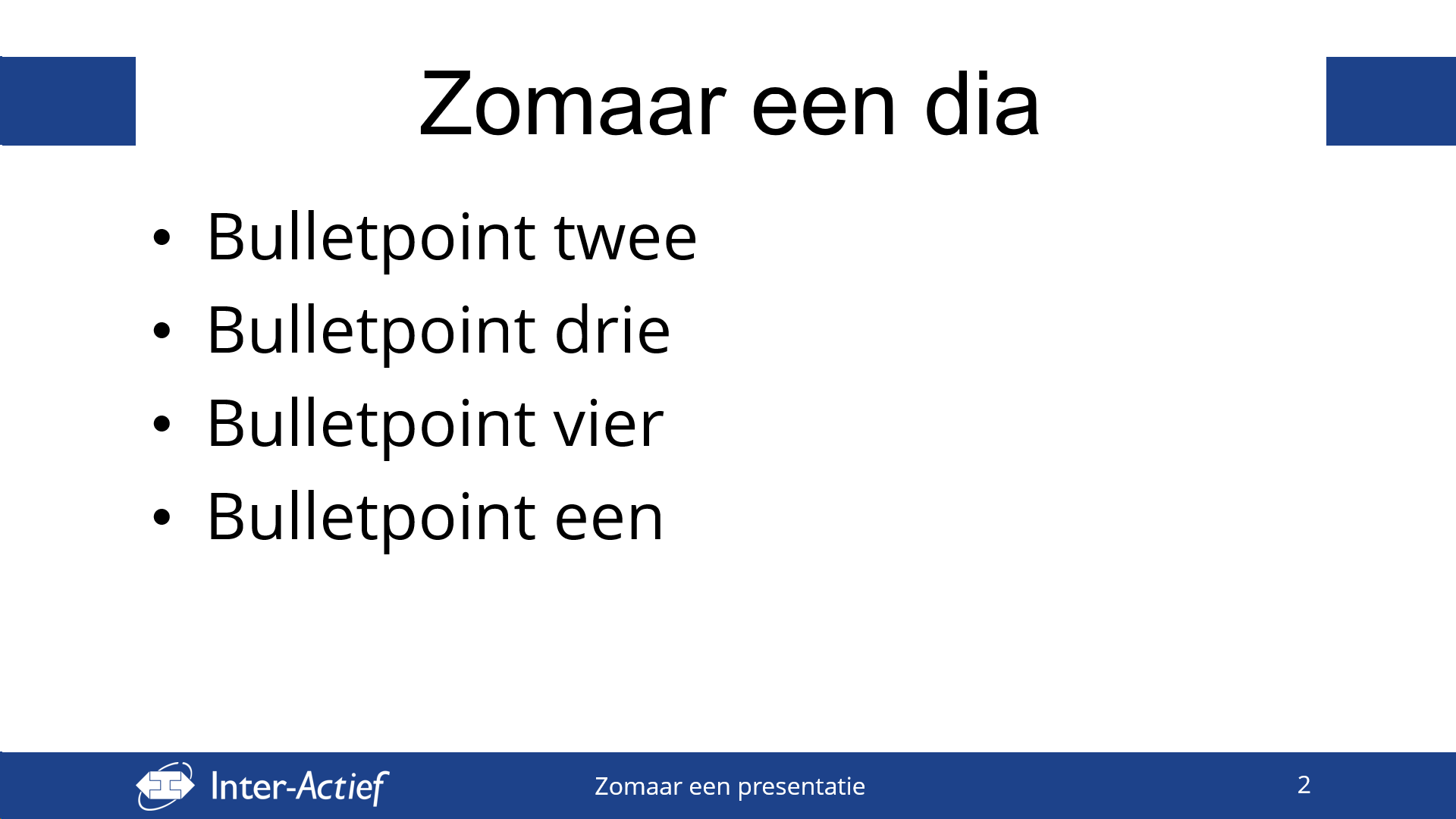
Presentation
You can use the presentation template when giving presentation related to Inter-Actief. This template contains a title slide and a default slide that can be used when making presentation. The templates is suited for widescreen presentations.
Examples
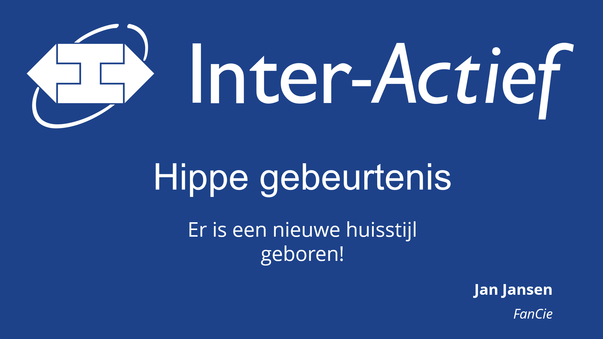
This is how it works
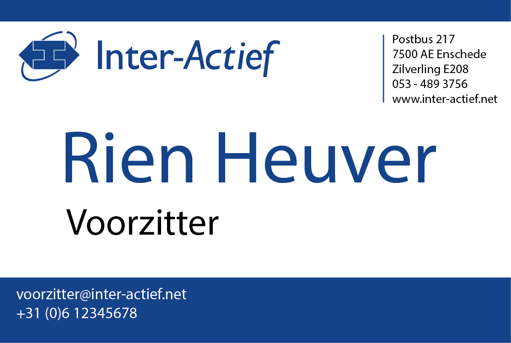
Business cards
The business card template consists of two parts in two seperate files, the front and back of the card.
The files contain a margin of 3mm so the printer can cut them more easily. Please tell this to the printer and also make sure the format is 85x55mm.
Examples
Other
This section contains files that do not deserve further explanation. They are however part of the corporate identity and as such can be downloaded here.